![brand Brand Design brand identity design identity logo Logo Design logo designer visual identity](https://mir-s3-cdn-cf.behance.net/project_modules/1400/c73a0b169770423.64afba378a60f.jpg)
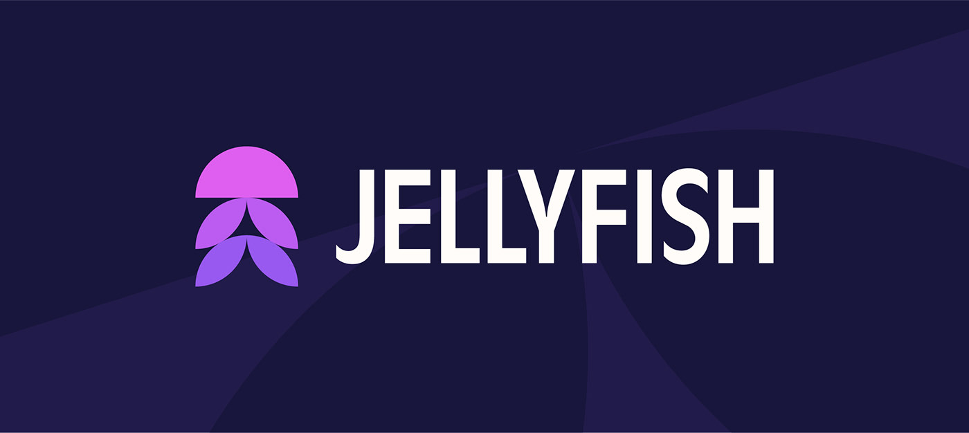
Taking on the online accountancy giants such as Quickbooks, Xero and FreeAgent, Jellyfish aims to be the simplest of them all. Quickly accessible and easy to understand, Jellyfish needed an identity that was true to this core brand pillar and position them uniquely against the competition.
![brand Brand Design brand identity design identity logo Logo Design logo designer visual identity](https://mir-s3-cdn-cf.behance.net/project_modules/1400/e2ed8e169770423.64527fb261ac1.jpg)
With simplicity at the forefront of my mind (and the brief), I played around with many different executions of a J and F, a jellyfish itself, a piece of jelly in the shape of a fish, etc. but found that when I distilled a jellyfish down to its most basic shapes, I could recreate it with only circles. After a few refinements, I was really happy with the outcome! All I needed to do was pair the logomark with some appropriate typography that had some character yet could be versatile and professional. I found this with Antique Olive. It has some really unique and quirky shapes but is based on a clean sans-serif so we ticked all the boxes I wanted to tick.
![brand Brand Design brand identity design identity logo Logo Design logo designer visual identity](https://mir-s3-cdn-cf.behance.net/project_modules/1400/69b29f169770423.64527fb25c740.jpg)
![brand Brand Design brand identity design identity logo Logo Design logo designer visual identity](https://mir-s3-cdn-cf.behance.net/project_modules/1400/c5554a169770423.64afba378961d.jpg)
![brand Brand Design brand identity design identity logo Logo Design logo designer visual identity](https://mir-s3-cdn-cf.behance.net/project_modules/1400/bbf138169770423.64527fb25ab5f.jpg)
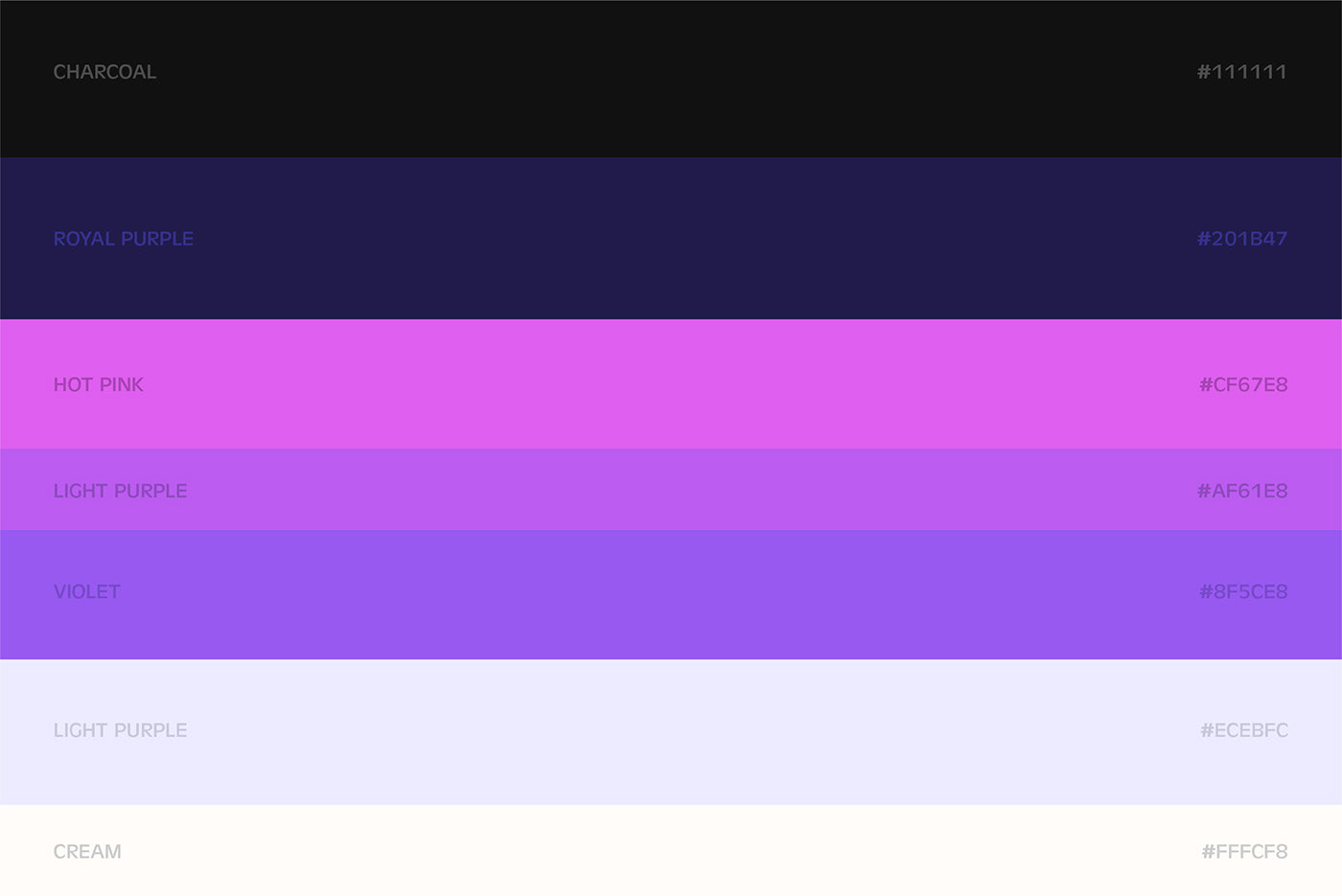
To bring the identity to life, I needed to select a colour palette that would be uniquely ownable, bold and playful. I couldn’t stop thinking about the jellyfish in SpongeBob Squarepants and so I explored the colours the illustrators used for this identity. After a couple of tweaks, I found that this actually worked really well and gave a fun story to how the colour palette of the identity was founded.
![brand Brand Design brand identity design identity logo Logo Design logo designer visual identity](https://mir-s3-cdn-cf.behance.net/project_modules/1400/03737d169770423.64527fb25d444.jpg)
![brand Brand Design brand identity design identity logo Logo Design logo designer visual identity](https://mir-s3-cdn-cf.behance.net/project_modules/1400/70de39169770423.64527fb2600a5.jpg)
![brand Brand Design brand identity design identity logo Logo Design logo designer visual identity](https://mir-s3-cdn-cf.behance.net/project_modules/1400/b92591169770423.64527fb25b953.jpg)
![brand Brand Design brand identity design identity logo Logo Design logo designer visual identity](https://mir-s3-cdn-cf.behance.net/project_modules/1400/8d449f169770423.64527fb25f303.jpg)
![brand Brand Design brand identity design identity logo Logo Design logo designer visual identity](https://mir-s3-cdn-cf.behance.net/project_modules/1400/c71506169770423.64527fb260eaf.jpg)