NOTE: This is all spec work, not chosen by Nike, and done at Blackboard Co. advertising.
ASSIGNMENT: REDEFINE NIKE+. EVERYONE KNOWS IT’S AN APP. WE NEED TO REBRAND
IT TO EXPAND INVOLVEMENT IN RUNNING. IN SHORT, WE NEED TO MAKE PEOPLE
UNDERSTAND THAT IT IS NOW BEYOND TECHNOLOGY; IT’S THE PHYSICAL ACT OF RUNNING
ON A RUN TEAM(S) THAT ANYONE CAN JOIN.
DEFINE A CLEAR STRATEGY AND EXECUTION AROUND NIKE+ TO ENSURE
CONSISTENT QUALITY FROM ONE CHAPTER TO THE NEXT. THE OPPORTUNITY IS TO BE THE
FIRST BRAND TO PROVIDE ALL TYPES OF RUNNERS WITH A FULLY IMMERSIVE EXPERIENCE
THAT WILL GET THEM RUNNING OR CONTINUE TO INSPIRE THEM TO DO SO.
GOALS: 1. BE THE ONE-STOP SHOP FOR EVERY RUNNER’S NEEDS (COACHING, PRODUCT,
SERVICES). 2. INSPIRE NEW RUNNERS AND HELP EXISTING RUNNERS TO IMPROVE.
3. CONTINUE TO FUEL THE RUNNING CULTURE. 4. HAVE FUN.

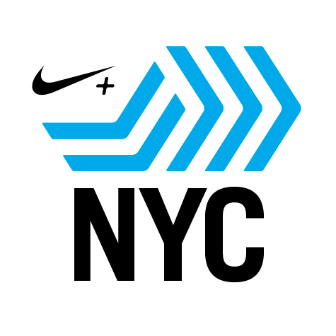

This mark shows movement. It’s active. It also shows multiple people running together. The bend of the legs is the perfect landing for Nike+.
The city names are always abbreviations. Set in Trade gothic bold condensed, The city name is the foundation for the design. it anchors it. while everything else seems fluid and active, it seems to be on firm, solid ground.
As a pure black and white mark it has a strong architectural feel and yet rounded corners add humanity. the vertical legs can be a color separate from the horizontal legs.


OTHER CONCEPTS


OTHER CONCEPTS


